The Layout
Level design layouts remind me of this pithy quote by Corbusier - "The Plan is the Generator." I'm pretty firmly in the Can't-Stand-Corbu camp, and that line in particular always annoyed me. Generator of what? Is the plan the exclusive generator? Why not the sketch? Or the thumbnail? Or the model? Or the section? Or the site? Or the phenomenology?
Corbu was obliquely referencing the "program" of the architecture with his emphasis on plan. The program defines the area requirements of the building (i.e. the square footage of the bathrooms, etc), and implies a kind of hierarchy. The architect supposedly then translates the program into a plan drawings, and defines the spatial composition through section.


Corbu was obliquely referencing the "program" of the architecture with his emphasis on plan. The program defines the area requirements of the building (i.e. the square footage of the bathrooms, etc), and implies a kind of hierarchy. The architect supposedly then translates the program into a plan drawings, and defines the spatial composition through section.
That's a pretty reductive way of thinking about architecture, and one that has been well-challenged by people smarter than me. Level designers can get away with a plan-focused mentality because of how loosely we treat these layouts. They're meant to give a sense of flow and progression, some idea of the level typology and the real-life corollary it's meant to imitate. The plan isn't gospel - rarely do we just hand it off to someone else to build, the way an architect hands the plans to a contractor, so there's no need for detail or accuracy.
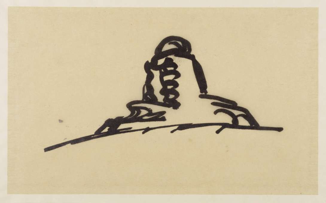
Our class homework for this week was to decide on an experience goal for a level, then develop two layouts - one "good" and one "bad." Here's my first pass at the "good":


I struggled a bit with coming up with a well articulated experience goal. For me the aura of the place and the procession of events makes for the experience, rather than some vaguely defined emotions like "the player feels a sense of x." I would just as well start from some points of inspiration, define a location and come up with a verbalized experience goal out of that.
The experience goal of this level is for the player to feel a sense of instability and precariousness. The player moves through a series of dilapidated towers connected by bridges, occasionally climbing stairs or ladders to re-traverse areas. It's linear, but tortuous - obstacles and debris, as well as the vertically spiraling arrangement, keeps the player from seeing exactly where they are going.
For the "bad" layout, I wanted to try making a layout that could be considered "good" if applied to a different design goal. The player would enter the two-story building and proceed around the different rooms, unlocking one after the other until they reach the goal.

It's a typical "gated hub" type of level design, and not particularly interesting in-and-of-itself, but could be used to generate a stealth type of level. The open central area naturally makes for a kind of unsafe prospect space - I could make it more dangerous for the character by adopting a rounded form and clearing it of furniture and the central staircase. The side rooms offer opportunities for refuge and temporary safety - good places to hide incapacitated guards or plan your next move. But with it's bi-axial symmetry and equilateral, stable form, it doesn't suit the initially stated experience goal.
These are at least decent starting places. I intend to keep revisiting both of these as I start to flesh them out in a game editor.

Comments
Post a Comment