GreyBoxes
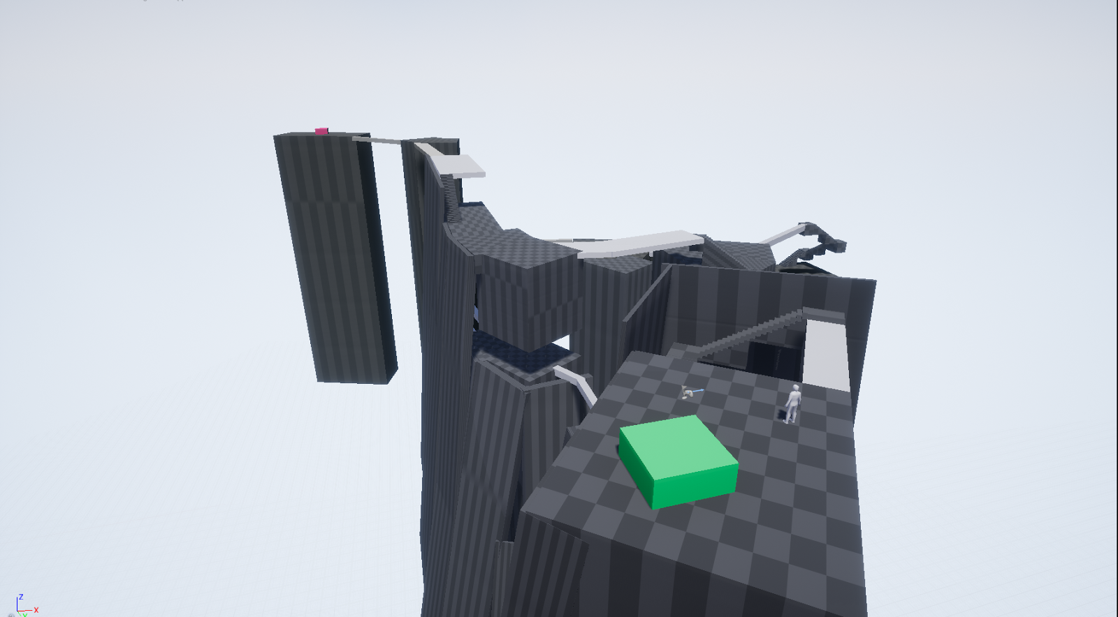
Following our layout critiques, our next step is to move the sketch into the level editor. Here's my first pass at the tower level:

The corollary to greyboxing in architecture usually involves moving around program spaces, rendered as boxes or bubbles, depending on their hierarchies and connective requirements. Here, the architect manipulates what will be voids, whereas the level designer manipulates solids. Maybe it's an arbitrary distinction - the ultimate result in both instances will be some configuration of occupiable spaces - but it's indicative of the tight spatial requirements of architecture (i.e. space is a commodity) and the obsession they have with form. I remember an architecture professor cautioning against us moving into formal considerations "too early" in the process, but there's no such admonition in level design.

So does this particular space serve the purpose of "precariousness and instability?" At the moment it's pretty dull - there are no enemies, and the bridges are easily traversed. Composition-wise, the opening vista has no vertical hierarchy, and the penultimate destination is obscured by a bad sightline.
We had a bit of class time to muck around with our greyboxes, so I made some changes to the level. The first was to add a bit of first person platforming, just by creating an easy jump across a broken bridge.

As much as I hate first person platforming (unless it's done very well, or supplemented with a vertical traversal tool), this small gap immediately made the level more tense.
I also changed one of the towers to resemble a building frame, which gave the level a skeletal feel.

Then I adjusted the overall composition of the level by giving the layout a larger angle, so the player can see the ending position from the start. It's now starting to feel a bit more interesting and dramatic. Unfortunately I need to shelve this design for the time being. Our next assignment is to look at the critical path of a level - the minimum distance that the player can take from start to finish.


Comments
Post a Comment